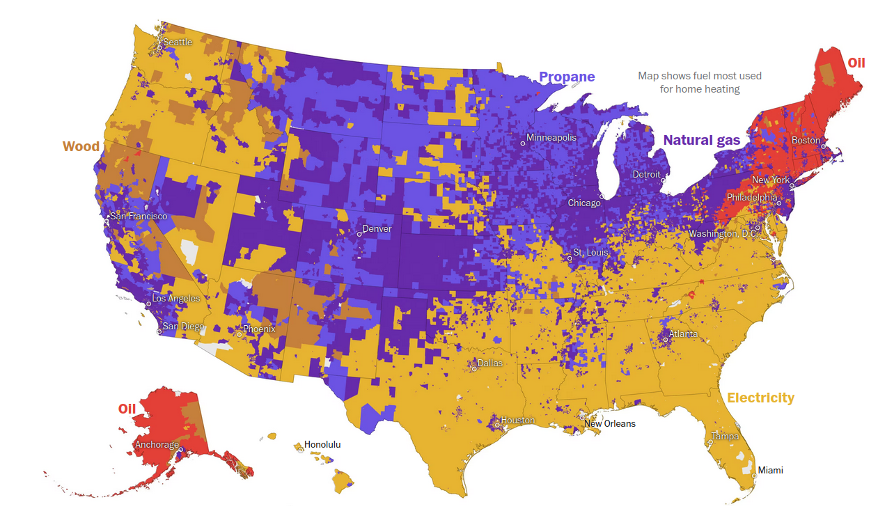
RIGHT? It’s almost like it was designed to make you puzzle over it for longer than you should have to. The second image is easier to digest-- It’s labeled properly, and you can sort of tell that areas would overlap.
First one could be redeemed with a little bit of information hierarchy, but it’s pretty obtuse as-is.