
1161·
1 month agoFor sure. But of course dude tried a coup on live tv and we are having trouble getting the justice system to hold him to account. So getting proof of the NFT scheme that I outlined as a hypothetical is probably going to be harder.
For sure. But of course dude tried a coup on live tv and we are having trouble getting the justice system to hold him to account. So getting proof of the NFT scheme that I outlined as a hypothetical is probably going to be harder.
A lot of his value is tied up in assets that aren’t liquid (real estate). Also he is probably not worth as much as he says.
But the main reason is that these “cheap crap” things you mention are probably vehicles for money laundering from foreign actors. The best example are the NFTs he was hawking for awhile. Costs next to nothing to make and foreign states can buy a ton of them to give him money without it being easy to detect. Even if it is detected it is still legal to buy silly NFTs, right? Certainly more so than a foreign government giving a candidate bags of cash for nothing.

I’m confused - doesn’t everyone just leave Satisfactory running to increase production??
/joke
Remember, it’s not just fun. It’s contractually obligated fun fun fun!
The lung motion is be a problem but it is still done in some situations and the radiologist just tries their best with any motion artifacts. Since the blood vessels are so big in the chest it kind of works out, but it turns out better with contrast.
Radiologist here. 👋🏻
You are right it does not require contrast. The scan uses a special technique to reduce signal from tissue that isn’t moving so only things that are moving produce high signal and show up “bright.” Since blood is the only thing really moving in the brain - voila!
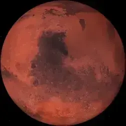
Since October 2023, the rover has been exploring a region of Mars rich with sulfates, a kind of salt that contains sulfur and forms as water evaporates. But where past detections have been of sulfur-based minerals — in other words, a mix of sulfur and other materials — the rock Curiosity recently cracked open is made of elemental, or pure, sulfur. It isn’t clear what relationship, if any, the elemental sulfur has to other sulfur-based minerals in the area.
A 5 ounce bird can not carry a one pound coconut.

Not to mention nothing familiar to provide scale. As I was watching I was like are we 100 km above the ground or 100 m?
What in the pseudoscience is this?

I have no evidence of this theory but I suspect that it is partly a result of careful manipulation.
Many buttons/menus in iOS utilize the blue color for text or backgrounds that also is used when you message another iOS device. The result is that it feels congruent and natural within the color scheme of the operating system - if you are messaging an Apple device.
The green color used for messages to non Apple devices is somewhat jarring in comparison and subtly (or subconsciously) gives you the impression that something is not right. Additionally the green that was chosen provides less contrast to the white text (relative to the darker blue & white). So reading the green bubbles is just a little more effort. These effects combine to a general sense of unpleasantness.
I believe all of this is deliberate on Apple’s part and isn’t as simple as someone “caring” about colors but rather the situation being engineered to make them care.


I believe that it is illegal, yes (I’m not a lawyer). But that is the point. They can “buy” a bunch of cheap useless stuff from him instead of giving him money. That’s the essence of money laundering. Do something that superficially looks legitimate so that you can move a bunch of money that would otherwise be illegal.