
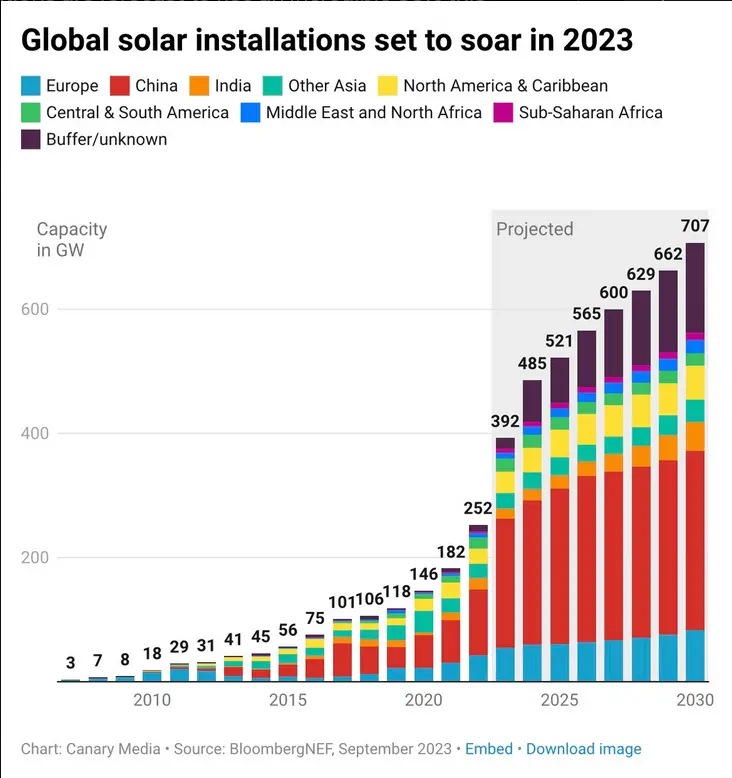
This graph does what every other predictive graph does, cuts the superlinear growth short just after one year. It’s guanteed to be very wrong. At some point we will have way more solar than needed and it will severely flat out, but I don’t think is even close it it.
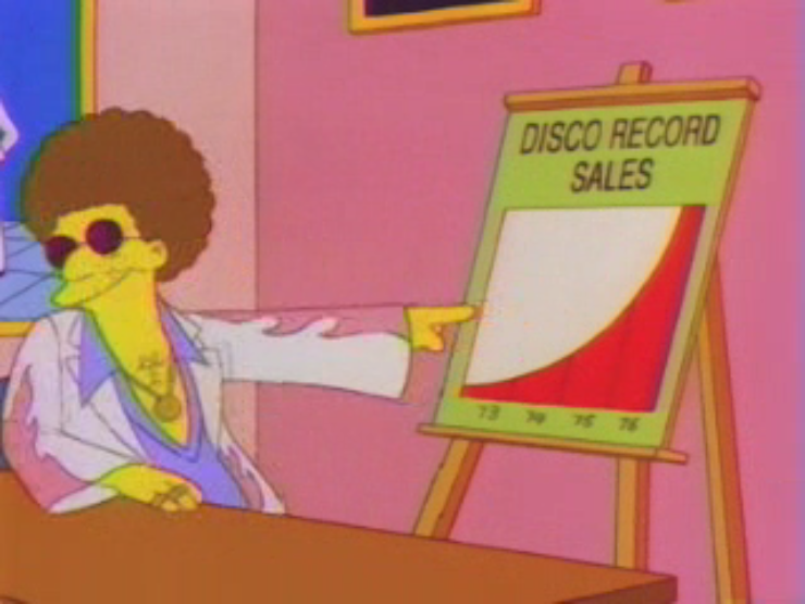
Edit: I forgot to add the quote for those that don’t know this Simpson’s scene:
“Did you know that disco record sales were up 400% for the year ending 1976? If these trends continue…ayyye!”
Yeah but it wouldn’t look as impressive that way. Amazing how you can manipulate data to fit whatever angle you’re pushing.
Good! Between regular renewables, I wish we had more fission development though as they are actually greener per kW produced interestingly.
Isn’t China also building a lot fission power plants atm?
Didn’t know that, cool!
Great example of how to pad your chart to push an agenda. Granted, I am for this agenda, but this kind of stuff definitely detracts from it.
When I read this type of projections, be it energy, money or whatever, it is always the next year that is exploding in volume
I thought we just spent trillions of dollars on more renewables
Much water waste !!! To c’ean them up

