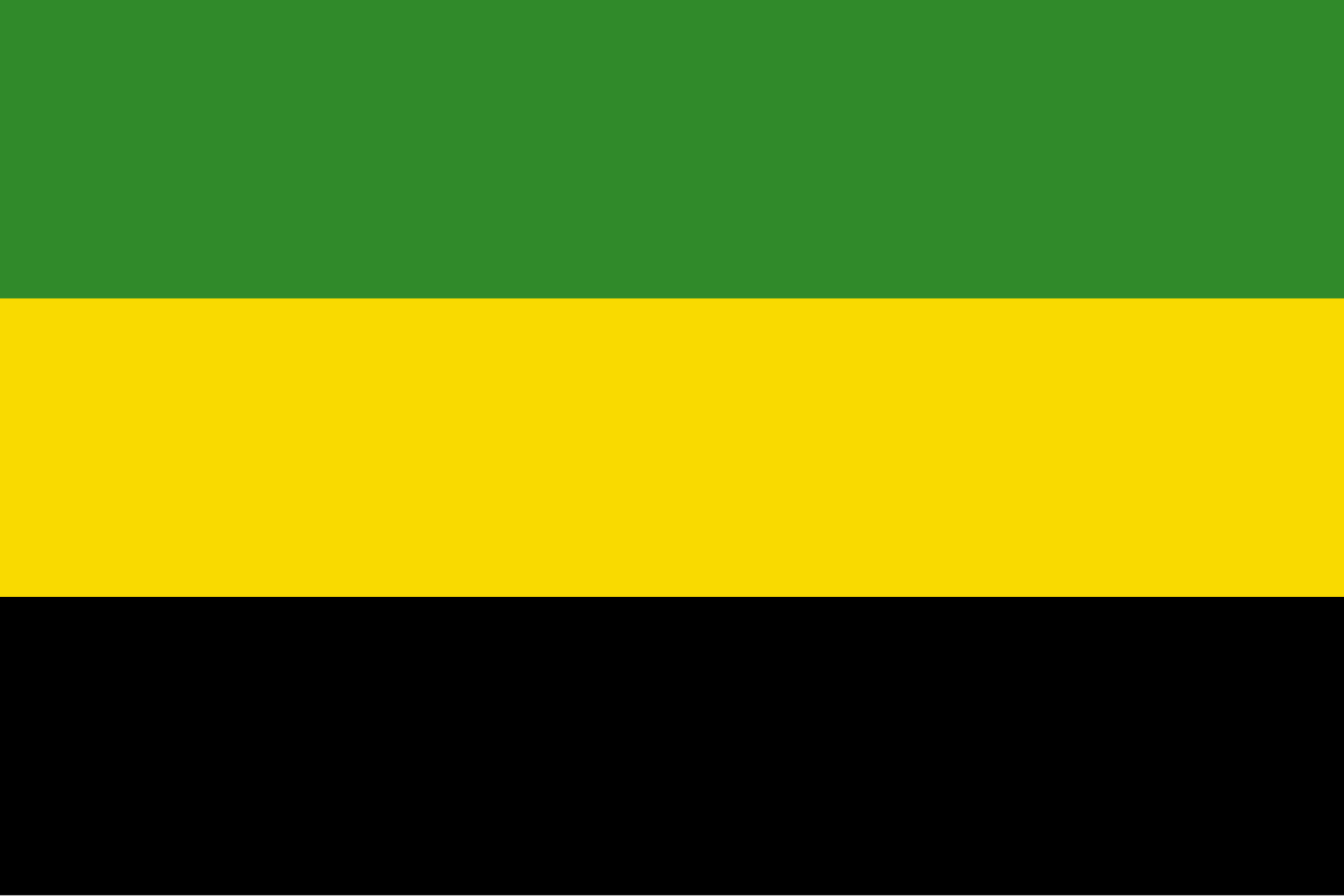
This was an initial proposal, with the same colors in a slightly boring horizontal triband:

Another proposal rearranged it a bit, but was discarded as too similar to the flag of Tanganyika, which seems quite reasonable, since they did not know that problem would be short-lived:

In the end they went for the saltire, which seems like a great choice, creating a more unique and interesting design.


I’ve never really thought about it, but what a great color scheme. And the saltire is definitely the winner of the bunch.