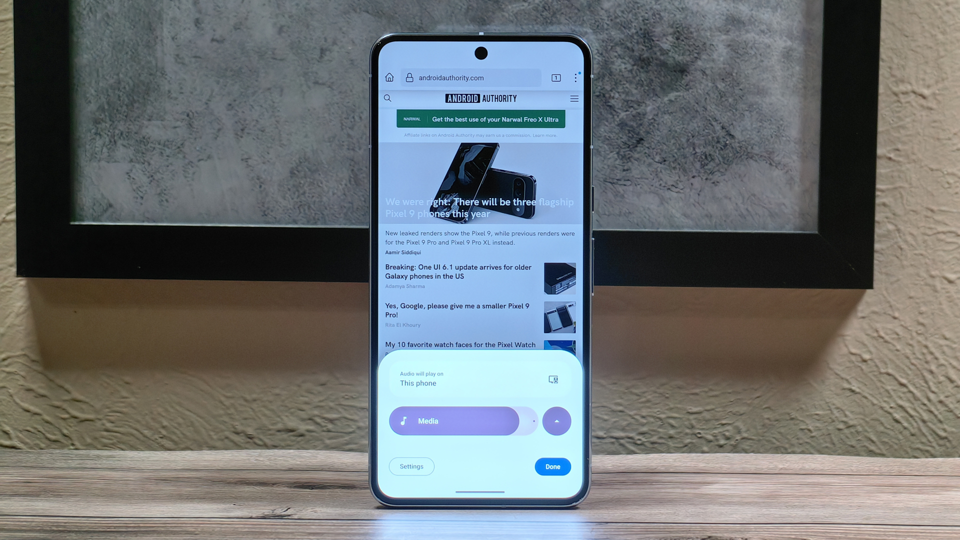
Can’t beat samsung’s implementation with sound assistant. It lets you put individual volumes for each app. You can even allow two or more music apps to play at the same time. For example a game and music. It also allows you to customize the volume panel as far as you want, such as position, theme etc. Not to mention you can also output to two bluetooth headphones at the same time.
I dont like samsung much. But i would totally miss this on most other phones. This android 15 panel just seems lame in comparison.
Has been the same on Xiaomi for ages too
Motorola has it too
Most of the UI changes they make, make things worse.
Round ALL OF THE CORNERS. Is there a button in the corner of you game that you’ve always loved to play in multi-window? How about fuck you?
Frequent user of YouTube picture-in-picture? You don’t need those corners, and also you don’t need the window to be ANYWHERE except the edge of the screen and if you’re using landscape you can just get fucked.
Everything has to be larger, wasted space is everywhere.
What a shitty trend.
It feels like every new android change now is taking something from Samsung 7 years ago, but making it 5 times the size
It’s a bit weird. Samsung’s UI nowadays is actually more compressed than stock android.
That looks bubbly as fuck.
finally, it looked very outdated compared to the rest of the UI
I vaguely remember a collapsible volume UI back in the android 4 days, though that might have been a CyanogenMod thing


